JULY 19, 2024: THIS USER'S MANUAL IS OUT OF DATE.
DOWNLOAD THE UP-TO-DATE MANUAL NOW!
The VOACAP Online HF Predictions service (voacap.com/hf) is a replacement for and a consolidation of the previous VOACAP Online P2P (point-to-point) service at voacap.com/p2p and VOACAP Online Coverage Maps at voacap.com/area. These two previous services have been closed down.
The new service uses VOACAP (Voice of America Coverage Analysis Program) as its calculation engine, requiring the use of a reasonably new web browser. For example, the latest versions of Microsoft Edge (but not Internet Explorer), Mozilla Firefox, and Google Chrome are known to work. The earlier versions may not be supported. If you encounter problems with the service, please try first to upgrade your browser to the latest version available.
Sometimes problems may arise if some of your input values have been saved in your browser as cookies. Be sure to clear all the cookies and re-set your input values (such as the TX/RX sites, power, antennas, etc as needed) because the site is constantly being updated, and in rare occasions new additions may interfere with your old cookies.
If you think you have found a bug or if you wish to help translate the user interface into your language, please contact me at jpe@voacap.com.
1. The interactive map for setting the transmitter (TX) and receiver (RX) site coordinates
Originally, a smooth and an easy coordinate entry for the Transmitter (TX) and Receiver (RX) sites was one of the single most important design features at VOACAP Online. The stand-alone PC version of VOACAP does not offer this, and, in fact, not many other similar software do, either. Choosing an interactive map for this purpose considerably lowered the threshold of using VOACAP.
 |
| Click to enlarge the main screen image. |
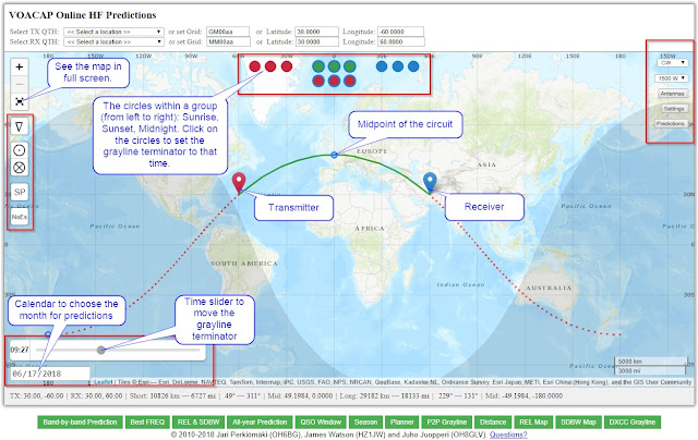
On the initial map, there are two markers -- red and blue -- placed on the map, placing the midpoint of the circuit at the zero longitude. The red marker signifies the transmitter's location (TX) and the blue marker is the receiver's location (RX). Perhaps typically, the transmitter is your QTH, and the blue one is the DX station, or in any way you like.
The easiest way to set the coordinates is to drag the red (TX) and blue (RX) markers to their appropriate locations on the map. Under the map, the distance calculations from TX to RX are being displayed in kilometers and miles, and the bearing in degrees from True North, via the great-circle Short Path and Long Path. If you need to zoom in or zoom out the map for better details, just scroll the mouse wheel up and down over the map, or click the plus (+) and minus (-) icons in the top-left corner of the map.
To quickly swap the TX and RX points, just double-click the blue (RX) marker. Whenever the locations have been swapped (or moved), the propagation prediction, together with other details, is re-calculated. By swapping the TX and RX locations, you will quickly see that the predictions for circuits are not always 100% reciprocal. In VOACAP calculations, this is mostly due to the different level of noise power at the RX site(s).
The coordinate input values for the TX and RX can also be set in the area above the interactive map in three different ways:
- by selecting a DXCC country from a pop-up menu
- by entering a Maidenhead Grid Locator manually, or
- by entering latitude and longitude coordinates manually
In the TX and RX sections you can choose the location from a list of DXCC countries. The QTH pop-up menu features 483 locations around the world, including all DXCC entities. When you choose a location from this list, its name and the coordinates (latitude and longitude) will automatically be entered in their corresponding fields. Much care has been taken to find the exact coordinates of even the smallest of the islands! If you happen to find a location with wrong coordinates, drop me a note!
When you drag the markers over the map, the Maidenhead grid locator will be displayed in the Grid field. You can also enter the grid locator manually, and press the TAB key: the corresponding coordinates will then automatically be calculated from the grid locator and entered in the Latitude and Longitude fields. The latitude and longitude values can also be entered manually.
Two great-circle paths: short-path and long-path
There is always a solid green line and a dotted red line connecting the red and blue markers. The green line shows the great-circle Short Path and the red line great-circle Long Path between the two locations. The small blue circle along the two great-circle lines indicates the geographical midpoint between the Transmitter and Receiver along that path.
The data bar below the map
The details of the on-the-fly calculation of the distance between TX and RX (in kilometers and miles), and the bearing from TX to RX in degrees, calculated from True North via Short Path and Long Path can be seen under the map. Also, the geographical midpoints of the two paths are displayed there.

- The latitude and longitude of Transmitter (in degrees)
- The latitude and longitude of Receiver (in degrees)
- The Short Path distance from Transmitter to Receiver in kilometers and miles
- Short Path bearings. The first value = the bearing (in degrees) from True North from Transmitter to Receiver. The second value = the bearing (in degrees) from True North from Receiver to Transmitter.
- The latitude and longitude of the geographical midpoint of the circuit from Transmitter to Receiver via Short Path
- The Long Path distance from Transmitter to Receiver in kilometers and miles
- Long Path bearings. The first value = the bearing (in degrees) from True North from Transmitter to
Receiver. The second value = the bearing (in degrees) from True North
from Receiver to Transmitter.
- The latitude and longitude of the geographical midpoint of the circuit from Transmitter to Receiver via Long Path
2. The date and grayline terminator
The whole concept of setting the date in VOACAP Online services has been changing over the years. Earlier, I was showing the grayline terminator that was always fixed to the current time and day -- the user was not able to set it to a specific time and day in order to see how the grayline terminator looked like at a particular point of time. I felt that a more flexible grayline zone map could be used as a way of trying to determine signal enhancements on the low bands, and therefore a new way of setting the time and day was needed.
 |
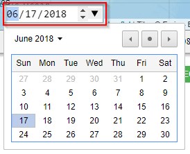
| The calendar is rendered differently in different browsers. In some browsers, you should click on the date field; in others, click the black downward arrow right to the date field. |
This was the reason I have again chosen to use a pop-up calendar for this purpose. This functionality requires that a reasonably new browser is being used. Any month the user will select from the calendar will be used as the date input for all propagation predictions (except for coverage area maps which have separate input values). The pop-up calendar is located in the bottom-left corner of the map, and looks like this:
To set a date, click on the calendar date field. It will prompt a calendar where the user can browse the months (and years) back and forth by pressing the left and right arrow icons. Select a month by clicking any day number in that particular month. Please note that you must select a day, any day!
The month selected will be used for propagation prediction calculations, and the day selected (and the time set by the user, using the time slider above the calendar field) will be used for drawing the grayline zone terminator over the interactive map. Please note that the day selected will not be used for propagation prediction calculations as VOACAP will not provide any daily (or near-real-time) predictions.
Again, use the time slider above the calendar to move the time of day, and see how the grayline terminator moves accordingly. The time in UTC is being displayed to the left of the time slider.
3. Inspecting sunrise and sunset times
The three sections of circles (colored red, green and blue) on the top part of the interactive map offer the sunrise and sunset times at Transmitter, Midpoint (via Short-Path (first row) and Long-Path (second row)), and Receiver respectively on the given day. All times are UTC.
 |
1) Transmitter; 2) Midpoint of the circuit (Short-Path);
3) Midpoint of the circuit (Long.Path); 4) Receiver |
These calculations were originally inspired by Steve's (G0KYA)
more-than-15-year-old article about grayline propagation. In short, the best predictions for grayline propagation or trans-terminator enhancement on low bands can probably be achieved by a close examination of grayline maps. Some also swear by
W6ELProp. To dig deeper into sunrise and sunset times, you may also be interested in reviewing the “DXCC Grayline” button.
Please note that all the circles can be clicked on, and the interactive map will show how the terminator line will run across the map at the time clicked on. This can be very useful in determining the best times for low-band signal enhancements.
4. The input parameters for predictions
There is a number of user-adjustable parameters in the pop-up menus and buttons on the left and right sides of the interactive map that will affect all the propagation predictions.
4.1 The left side

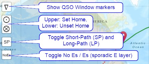
Set Home: By clicking on the Set Home button on the left side of the map, the Latitude and Longitude information is stored in a cookie, as well as the RX Latitude and Longitude, along with the TX and RX antenna selections. And when you press the Unset Home button, the cookie will be destroyed. Remember to allow your browser to set the cookie on this page if you want to allow this feature to work.
Great-Circle Path (default: SP). This is a toggleable button between Short Path (SP) and Long Path (LP). This setting will be used in many of the calculations you can choose among the 12 green buttons below the interactive map.
Es, or use of the ionospheric sporadic E layer, Es (default: NoEs). This may (or may not) prove useful during summer months when Es propagation conditions can be quite predominant. The default setting is OFF (NoEs). Please note that the use of the Es layer is otherwise discouraged as the sporadic-E model was not fully tested during the development of VOACAP. Also, the effects of the sporadic-E layer are not totally excluded in VOACAP calculations although the layer would not be set to ON.
Maidenhead Grid, or show/hide the Maidenhead locator grid overlay (default: NoM). Toggle the Maidenhead Grid overlay on the map ON and OFF. The default setting is OFF.
4.2 The right side
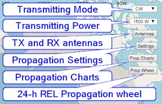
a) The Transmitting Mode pop-up menu. This menu allows you to choose from WSPR, FT8, CW, SSB and AM. CW is the default setting.
b) The Transmitting Power pop-up menu. This menu allows you to select powers from 1 watt to 1500 watts at the steps given. 1500 W is the default setting. Some line loss is assumed so that the actual power used for calculations is 80% of the power chosen.
c) The “Antennas” button. An antenna can be chosen for all amateur bands separately. All TX and RX antennas are artificial in the sense that they are omnidirectional, which in turn allows the user to see all possible openings to all parts of the world. In dipole-type of antennas, the height of the antenna is related to the elevation angle and the number of elements to the gain.
When you choose an antenna, you should think about the elevation angles and gain, rather than the physical structure of the antenna.
Also note that the TX and RX antenna selections can be quicly swapped by clicking the "Swap TX/RX antennas" button.
d) The “Settings” button. Clicking this button opens an overlay window from the left side of the map. Three parameter sections are available here: General Propagation Settings, Coverage Area Map Settings, Propagation Planner Settings, TX Antenna Analysis Settings, and Take-off Angle Analysis Settings.
General Propagation Settings
Noise. This is the option of choosing the noise level at the RX site, and the selection is used not only for point-to-point calculations but also for coverage area map calculations where a matrix of single RX site points share the same noise value. The Noise value will affect the QSO probabilities: when there is a lot of man-made noise, the probabilities are lower; when the noise level is minimal (e.g. “Quiet” (default) or “Remote”), then the probabilities are better.
SSN, or user-settable smoothed sunspot number (default: -1). Here you can set a specific SSN (i.e. sunspot number) to be used for calculations. Note that this service knows current predicted smoothed sunspot numbers for a few months ahead so it may be advisable not to set any value to the SSN field unless you wish to conduct your own propagation experiments. The default value of -1 means that the service will automatically use the predicted values.
At this point, I would like to take a few moments to discuss the pros and cons of this feature. By default, this service does internally know the current SSN to be used for approximately 6 to 9 months into the future. If no sunspot number is found for your future prediction, the SSN will be set to zero. This means you will have to set the SSN manually.
Please note that VOACAP does not operate on daily SSN figures but on smoothed monthly SSN figures which are being predicted for many months ahead and which are also re-adjusted at regular intervals.
The predicted SSN figures are based on the Lincoln-McNish smoothing function, and they are currently being maintained by WDC-SILSO, Royal Observatory of Belgium in Brussels. These are the sunspot numbers used in the database reduction for the worldwide ionospheric maps used in IONCAP and now VOACAP. This is why only these figures should be used with VOACAP. Read George Lane's discussion on the sunspot numbers for VOACAP use.
In addition, there have been months in the past where the conditions have been well above the average for a couple of months, and a re-adjustment of SSNs would have been appropriate. Now this power has been given to the user. Just remember that, strictly theoretically speaking, entering a daily SSN value in the SSN field does not generally give you better (or more precise) predictions as VOACAP is not suited to real-time predictions at all. Read more about the theoretical background of VOACAP in my Quick Guide.
Dyn SSN: Check this option if you want to use the running last-three-day average of daily sunspot numbers. This can be useful when the daily sunpot numbers considerably differ from the predicted monthly smoothed sunspot number. Please note that this option is experimental.
Method, the choice of the VOACAP propagation model: Auto, Ducted, and Ray-hop (default: Auto).
- The default "Auto" or automatic model refers to Method 30 in the VOACAP speak. It's a propagation model that chooses automatically either the ray-hop model or the ducted (forward-scatter) model to predict the signal power. There is also a smoothing function for ranges of 7,000 km or greater.
- The (forced) "Ducted" model refers to Method 21 in the VOACAP speak. Typically, this model is used for paths of 10,000 km or more. The Ducted model forces VOACAP to simulate the ducted or forward-scatter mechanisms that can prevail usually at distances having three or more hops. This model may produce unrealistic results at shorter distances where the ray-hops should occur.
- The (forced) "Ray-hop" model refers to Method 22 in the VOACAP speak, typically used for all circuits less than 10,000 km. It's a model that contains multiple ionospheric reflections, and includes all of the ionospheric and earth bounce losses. This model may produce extremely pessimistic predictions at the distances beyond the third ionospheric hop where ducted/forward scatter mechanisms can occur.
Min. TOA, or the minimum takeoff or arrival angle for antennas. This option offers angle values at the steps of 1 degree, starting from 0.1 degrees, up to 5 degrees. My default value has so far been 0.1 degrees, due to some practical reasons, but now I have chosen a new default, 3.0 degrees.
If you use a Min.TOA of 0.1 degrees with antennas of higher takeoff angles, VOACAP can miss the most reliable propagation mode which is at a higher angle. How
can this be? We have to remember that VOACAP only considers 3 modes for
each ionospheric layer. So if VOACAP starts with 2F2 mode, then only
the 3F2 mode and the 4F2 mode will be considered for the most reliable
mode.
Should you have highly efficient antennas with very low take-off angles, then please use the Min.TOA of 0.1 degrees. So, setting the Min.TOA really depends on the antennas you use.
In the VOACAP literature, a value of 3 degrees is also commonly recommended, as it can be a common lowest angle for arriving skywave signals due to the roughness of the terrain. Also, 3 degrees may be a good choice if your antennas are not located in a flat, unobstructed area. And if you are using isotropic antennas, you should avoid huge amounts of antenna gain at angles below 3 degrees. You are encouraged to experiment between 0.1 and 3 degrees to see differences in predictions, using different antennas.
Coverage Area Settings
From the usability point of view, I feel that it makes sense to allow the user to enter some input values separately for coverage maps. You can choose the year, month, the UTC time, the plotting time range (Range), the band, as well as the TX and RX antennas.
At "UTC", choose the start time for your maps. The default is the current UTC hour.
Also for "Range", choose the time period for the maps to be plotted on screen. The default is 1, i.e. the map for the current hour. You can choose time periods of up to 12 hours, so to cover a 24-hour period, you will only need to make two runs. Unfortunately, running and plotting 24 hours, or 24 coverage maps, at one go takes a considerable amount of time and processing power, and may result in a server connection time-out, hence 12 hours is the limit. Currently, even running more than 6 hours may lead to a time-out on the server.
Propagation Planner Settings
The "DX Sites" allows you to choose from either CQ Zones or ITU Zones as well as all DXCC countries or DXCC entities by continent. Propagation Planner predictions use all the point-to-point settings as their input values, e.g. the Antennas, SP/LP selection and the Es setting, TX Mode & Power.
TX Antenna Analysis Settings
You can select a set of antennas whose performance can be evaluated against each other. Almost all of the available antennas can be evaluated. When clicking on the "Antenna" button below the world map, VOACAP will run all the TX antennas for the user-defined circuit on the given month. Note that these antenna sets are TX antennas, and the user-defined TX antennas will be overwritten; however, the used-defined RX antennas per band will be used.
The antenna codes are as follows:
- ISOTROPE = Isotrope, 0 dBi gain
- HVD025 = Half-Wave Vertical Dipole, feed at 0.25wl AGL
- V14 = 1/4 wl Vertical, with Average Ground
- V14GD = 1/4 wl Vertical, with Good Ground
- V32 = 3/2 wl Vertical, with Average Ground
- V58 = 5/8 wl Vertical, with Average Ground
- DxxM = Horizontal Half-Wave Dipole at xx meters AGL
- 3ELxxM = Horizontal 3-element Yagi at xx meters AGL
- 5ELxxM = Horizontal 5-element Yagi at xx meters AGL
- 8ELxxM = Horizontal 8-element Yagi at xx meters AGL
Take-off Angle Analysis Settings
You can select the time period of the entire year or the current month to evaluate how the antennas you have selected for the bands will cover the take-off angles predicted for the circuit. Press the "TO Angle" button below the world map to run the take-off angle evaluation.
e) The "Prop Charts" button. This button will display 15 toggleable prediction charts for all amateur radio bands from 10 meters (28 MHz) to 80 meters (3.5 MHz). The charts show e.g. the probability (or, the REL parameter in the VOACAP language) for a communication contact (i.e. a QSO) between the TX and RX sites. See more below.
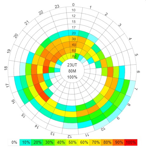
f) The "Prop Wheel" button. This button will display the famous 24-hour Propagation Prediction Wheel, showcasing the REL parameter only (REL = probability of a successful communication, see colors for the probability percentage). Keep this window open as you move the markers on the map, or change any settings. The predictions will change on the screen on-the-fly!
 |
The 24-hour Propagation Prediction Wheel, displaying the REL parameter results.
Your quick guide to propagation ... but be sure to take a look at more detailed analysis charts, e.g. "Prop Charts", too. |
16 different propagation predictions & tools available
There are altogether 23 different point-to-point and coverage map services available as clickable buttons below the world map.
Any of these green prediction service buttons provide a specific prediction in its own window. Click image to enlarge.
1. “Prop Charts” button
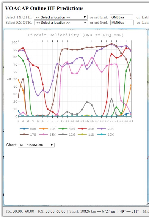
Clicking the "Prop Charts" button on the right side of the map display 15 toggleable prediction charts for all amateur radio bands from 10 meters (28 MHz) to 80 meters (3.5 MHz). The charts show e.g. the probability (or, the REL parameter in the VOACAP language) for a communication contact (i.e. a QSO) between the TX and RX sites. The "REL Short-Path" chart is the default. For most users, this chart may be enough for an overall understanding of the predicted propagation conditions. Other key prediction charts include SDBW (Signal Power) and MUFday. The calculations are available both via Short-Path and Long-Path.
 |
| Keep this window open, choose your output parameter, or the band of interest, and then change the TX and/or RX marker on the map. You will see the changes immediately in the prediction graph selected. |
The charts visualizing multiple output parameters contribute to a better assessment of HF propagation. You can paint the big picture with a single VOACAP output parameter but, for a more accurate picture, you will need (at least) three: REL (QSO reliability), SDBW (signal power), and MUFday.
Each chart offers multi-colored lines for the various parameters. And thanks to the JavaScript framework (plotly.js) used for plotting these graphs, all visible legend parameters/frequencies can be toggled on and off by clicking on the legend values on the bottom of the graphs, helping the user focus on relevant parameters/frequencies only. Also, there is a versatile toolbox on the top-right corner of each graph that allows the user to save the graph as PNG, zoom in/out, compare results data on all frequencies on mouse hover, pan the chart, and more.
But let's now make a recap of what the three parameters -- REL, SDBW, and MUFday -- mean to you.
The REL or Circuit Reliability. The REL is related to VOACAP's output parameters of SNR (Signal-to-Noise Ratio) and REQ.SNR (Required Signal-to-Noise Ratio), and is defined as a circuit reliability factor. It tells us the percentage of days in the month when the SNR value (which is not shown in the charts as a separate parameter) will equal to or exceed the REQ.SNR. The REQ.SNR is an internal value set by me, related to the transmitting mode selected. For CW, the REQ.SNR is set to 19 (dB-Hz), and for SSB, it's 38 dB-Hz.
SDBW or Signal Power. The Signal Power distribution tells us what levels of signal power at the receiver are to be expected over the days in the month on the given frequency at the given hour.
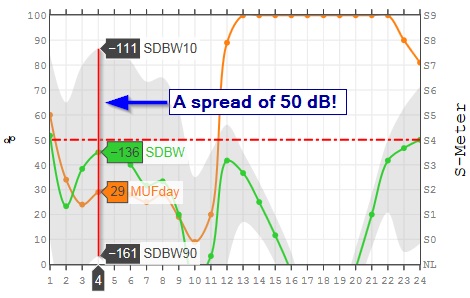
The SDBW indicates the dBW (the strength of a signal expressed in decibels relative to one watt) value (the green line in the chart) that can be maintained on 50% of the days (i.e. on 15 days) in the month. In a similar fashion, the SDBW90 indicates the dBW or signal strength value that can be maintained on 90% of the days (i.e. on 27 days) in the month. And finally, the SDBW10 is the dBW value that can be maintained on 10% of the days (i.e. on 3 days) in the month. However, it does not tell us which days are good or which days are bad. The SDBW10 and SDBW90 values are the top and bottom boundaries (respectively) of the light-gray area that is now always visible in all band-by-band prediction charts.
The MUFday will tell us what percentage of the days in a month at that hour will be below the predicted MUF (Median Maximum Usable Frequency) for the most reliable mode (MRM). The MRM is the mode with the highest reliability of meeting the Required Signal-to-Noise Ratio, or REQ.SNR (see above).
The REL and MUFday data is presented as percentages from 0 to 100 (%) whereas the Signal Power (SDBW) data is shown as dBW values from -164 to -103. The value of -164 is an extremely low noise value of my own choosing, and the next value of -157 represents a median S-meter reading of S0. The value of -103 corresponds to a median S-meter reading of S9. The steps are 6 dB or one S-meter reading step.
These three output parameters are being calculated via Short-Path and Long-Path.
Beware of extremely wide Signal Power distributions
Whenever you see that a Signal Power distribution is extremely wide, e.g. ranging from the S-Meter reading of S0 to S8 at any given hour, you are getting into the noise of the program, meaning that VOACAP will give predictions even when it has no idea what is going to happen. If we believe the prediction, then VOACAP is saying that 80% of the days of the month (bounded by SDBW90 and SDBW10) will have a Signal Power somewhere between S0 and S8. That is a spread of 48 dB! If the program could talk, it would tell you that it doesn't have a really good idea what is going to happen on that frequency at that hour.
 |
| The area filled with light-gray (= Short-Path Signal Power distribution) is bounded by the SDBW10 (top) and SDBW90 (bottom) values. Times and frequencies with extremely wide Signal Power distributions are not reliable enough. Typically, in such cases, the MUFday values are also low. |
So, how to use these charts? I regularly follow this sequence:
- Check the bands of the best REL values for the path in question. You can use the Propagation Wheel for that purpose.
- Then go to the Propagation Charts, and check the SDBW values for the best bands.
- When you have your candidate bands selected, then go to the specific charts for those bands.
- In band-by-band charts, pay attention to MUFday values, and the signal power (SDBW) distribution (the light gray area). If the distribution is extremely wide, there is a chance that VOACAP unfortunately does not have a good idea of what's going on.
- Be sure also to check the Long-Path predictions! On long-haul paths, Long-Path may bring nice surprises.
Then again, three more advanced prediction options are available, and these predictions can be calculated by clicking any of the three buttons below the Prediction Charts section:
2. Band-by-band Prediction, or all Prediction Charts on one page
If you wish to see all the prediction charts displayed on a single page available under the “Predictions” button on the right side of the map, click the button labeled "Band-by-band Prediction".
3. Best FREQ
The Best FREQ button provides an assessment of the Best Operating Frequencies for every hour of the day in a month for the circuit chosen. This means that all ham radio bands are being considered and, after a careful evaluation, the three best bands will be displayed, together with some VOACAP prediction data.
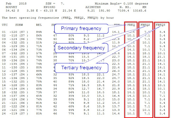
On the output page, the best operating frequencies can be found in the rightenmost columns: FREQ1 (primary), FREQ2 (secondary), and FREQ3 (tertiary). On the left, you will have the UTC hours from 1 to 24. And the other columns from left to right are as follows:
- SDBW (or Signal Power at the receiver): the dBW (the strength of a signal expressed in decibels relative to one watt) value that can be maintained on 50% of the days (ie. on 15 days) in the month. The S-Meter Signal Strength is displayed in parentheses after the dBW value.
- REL (or Circuit Reliability): percentage of days in the month when the SNR value will equal to or exceed the REQ.SNR (the threshold value for the given transmit mode); for example, the threshold value (= REQ.SNR) for CW is 24 (dB-Hz)
- SNR (or Signal-to-Noise Ratio): the median dB-Hz value that can be maintained on 50% of the days (i.e. on 15 days) in the month. So, if the SNR value is lower than the threshold or REQ.SNR value for a mode (CW = 24, SSB = 38, AM = 49, etc.), then not so great propagation may be expected at all times.
- MUFday: percentage of the days in a month at that hour will be below the predicted MUF (Median Maximum Usable Frequency) for the most reliable mode (MRM).
- FOT (or Frequency of Optimum Traffic): also known as the Optimum Working Frequency for the hourly MOF (median maximum observed frequency) distribution. At the FOT, communication can be supported on 90% of the days (27 days) in the month.
- MUF (or Median Maximum Usable Frequency): the median maximum usable frequency for a given ionospheric path, month, SSN and hour. On each day of the month at this hour, there is a maximum observed frequency (MOF) for a mode. The median of this distribution is called the MUF. Therefore, here MUF is not the maximum usable frequency in terms of communications. In other words, the MUF is the frequency for which ionospheric support is predicted on 50% of the days of the month, ie. 15 days out of 30 days.
- HPF (or Highest Possible Frequency): at the HPF, communication can be supported on 10% of the days (3 days) in the month.
Now, three Best Frequencies are being reported in the output. The SDBW, REL, SNR and MUFday values are reported for the Best Frequency (FREQ) only. In many cases, the Best and Second Best Frequency can be quite equal in performance so it can be hard to tell which one is actually better. However, on the other hand, the Third Best can sometimes be just a theoretical (or even an impossible) choice in practice.
 |
The best operating frequencies from Bouvet to my location on February 2018.
Primary = Best FREQ, Secondary = Second Best FREQ, Tertiary = Third Best FREQ |
It should be noted, though, that FOT, MUF and HPF cannot be used alone for reliable propagation predictions. The best predictions consider Signal Power, Circuit Reliability, and Signal-to-Noise Ratio values. And this is also what the assessment of the best operating frequency for each hour is based on.
Please be warned, though, that, as a consequence, there can be hours with the "best" operating frequency which does not, in reality, support any communication! The reason can be that the Signal Power, or Circuit Reliability, or Signal-to-Noise Ratio are too low at that hour.
In order to indicate that there can be problems with the best operating frequency given, there can be three signs after the Best Frequency (FREQ): - (minus), + (plus), or * (star). The minus sign means that the Signal-to-Noise Ratio predicted is below zero (i.e., a negative value); the plus sign means the REL value is below 10% but the median Signal Power is still barely above the noise; the star sign means that the REL value is below 10% and the median Signal Power is also more or less under the noise.
The minus, plus and star signs will be applied to the Best Frequency only. So, if the Best Frequency will be flagged with any of these signs, please note that the second best or the third best frequency will not be any better in performance but likely much worse.
4. REL | SDBW | SNR, or the original VOACAP point-to-point prediction graphs
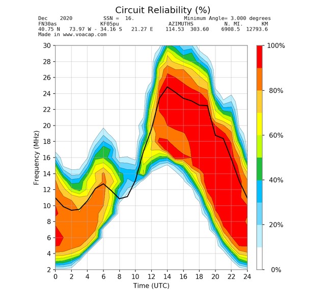
The “REL | SDBW | SNR” graphs were the first graphs generated at the VOACAP Online Point-to-Point site, and by pressing this button, the detailed propagation prediction graphs will be calculated for the entire frequency range from 2 MHz to 30 MHz, showing the REL (Circuit reliability) and S DBW (Signal Power) graphs for the circuit.
The black curve running through the graph is the median MUF; also there is a blue curve, indicating the FOT, or Frequency of Optimum Traffic.
 |
| The Circuit Reliability (or REL) graph, one of the three graphs calculated for the month chosen. |
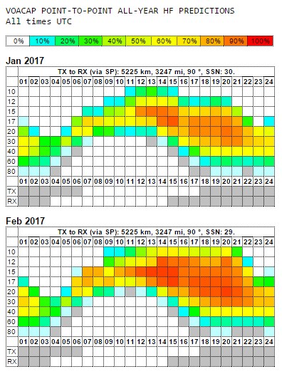
5. All-year Prediction, or point-to-point prediction tables for all months available at once
The All-year Prediction calculates the point-to-point predictions for the circuit (from TX to RX), covering the entire year and more if possible. The number of prediction tables generated will depend on the Sunspot Number predictions available from SIDC in Belgium. The colors in the table indicate the probability of making a contact between the TX and RX, using the TX mode selected (WSPR, FT8, CW, SSB or AM). All user-settable input parameters will be observed, except the Sunspot Number (SSN).
The All-Year Prediction tables are extremely informative as they nicely combine the Circuit Reliability (REL), Signal Power (S DBW) and MUFday data as well as sunrise/sunset times for TX and RX in one compact, interactive format.
So, with the introduction of MUFday in all assessments, there will be more gray cells in the prediction tables from now on.
On lower frequencies, the color of gray does not indicate any probability value, in contrast to all other colors used. Instead, gray shows that, although VOACAP does not predict any probability for that specific hour (R=0% in the pop-up window), some signal power (S in the pop-up window) has been predicted which may translate into workable conditions. So, in a sense, gray indicates "a gray area" where QSOs may be possible.
On higher frequencies, typically on Above-the-MUF frequencies, the color of gray is a sign of extremely poor probabilities. These are actually cases where VOACAP predicts positive REL values but unfortunately VOACAP does not know what's really happening up there. If you take a closer look at the values reported in the pop-up window over the cell (the R, S and M values), the S (Signal Power) value can be very low (e.g. -164 and below which means that there is hardly any signal in the noise).
Let me again explain the nature of MUFday as concretely as possible. The value of the MUFday is the fraction of the days in a month at that hour that the operating frequency is below the MUF for the most reliable mode (that is, the mode with the highest reliability of meeting the required Signal-to-Noise Ratio, or SNR). So, on higher frequencies, I have now set the threshold to 10% for MUFday in my assessments. This means that if the MUFday value is less than 10% (or less than 3 days), then the frequency hour cell will be colored gray. And it's totally ok, as this actually means that for more than 90% of the days in a month, QSOs are likely not to happen. The odds are pretty poor.
Recapping the R, S and M values
The R is VOACAP's REL or QSO probability in percentages, and the S is VOACAP's S DBW or Signal Power value in dBW. For instance, the signal power value of -164 can be considered to be on the verge of the noise in remote, extremely low-noise locations whereas the S DBW value of -103 corresponds to S9 on the S meter. Read more about translating the signal power values (S DBW) into S-meter values here:
http://www.voacap.com/s-meter.html.
And finally, the new M parameter is VOACAP's MUFday value in percentages, indicating the probability for the operating frequency on that hour being BELOW the median MUF calculated.
 |
| An all-year prediction for the circuit, showcasing the months of January 2017 and February 2017. |
In the table, the elements of the top row are as follows (from left):
- label for TX and RX,
- Short-path (SP) or Long-path (LP),
- the distance (kilometers & miles) of the circuit,
- the bearing (in degrees from True North) from TX to RX, and
- the Sunspot Number (SSN) used for calculations.
Below each prediction table, the sunrise and sunset times for TX and RX locations have been calculated and visually presented in the table cells below the UTC time row. The dark gray color denotes night-time and white day-time periods. The exact sunrise (SR) and sunset (SS) times (in UTC) will come up as you hover the mouse over the TX and RX label texts on the left column. Here, in this example, the sunrise (SR) at TX is at 0605 UTC and the sunset (SS) at 1813 UTC. The similar calculations are available for the RX site, too. The day used in the calculations is always the 15th day of the given month.
All colors, except gray, indicate QSO-making probabilities. In the prediction table per se, white means 0%, blueish 10%, greenish 30-40%, yellowish 50-60%, yellow-orangeish 70-80% and orange-reddish 90%, and pure red 100%. The color of gray does not indicate any probability value. Instead, it shows that, although VOACAP does not predict any probability for that specific hour, some signal power has been predicted which may translate into workable conditions. So, in a sense, gray indicates a heads-up note -- "a gray area" where QSOs may (or may not) be possible. Typically, these gray areas can mostly be found in low-band predictions (40 to 80 meters).
 |
| Propagation predictions use a color scheme from white (worst) to red (best). |
All predictions charts start at 01 hours UTC. You may ask, "Why not start at 00 UTC?". Well, it's a matter of taste. All VOACAP predictions span 60 minutes but not necessarily the way you may think. A prediction for 01 UTC does not span from 01:00 to 02:00 but, in fact, from 00:30 to 01:30 UTC! So, I decided, being inspired by the original makers of VOACAP, to start at 01 UTC and end at 24 UTC. Following the same logic, 24 UTC means a time frame of 23:30 to 00:30 UTC.
6. QSO Window: know your window of opportunity to work DX!
The QSO Window offers a unique functionality for exploring the windows of QSO-making opportunities. This service was inspired by Risto OH3UU and Cesar PY2YP.
By default, on the interactive map, you will see two markers (for TX and RX). Another five markers can be revealed by clicking the triangle-shaped button on the left side of the map. These are the sites of the "competing" locations that are trying to make a QSO with the DX station, too. Now, for you to able to see your chances in relation to the other five, the QSO Window function runs five extra propagation predictions from the five sites to the DX site (RX), and displays the results as interactive charts where you can easily compare the output values to those from your location.
To fully leverage the new functionality, you should set the location of the Transmitter Site (TX) to your QTH, and the location of the Receiver Site (RX) to that of the DX. The five red markers are additional Transmitter sites, too, and their default locations have been chosen to reflect perhaps a typical set-up:
- West Coast USA
- East Coast USA
- South Europe (Italy)
- East Europe/Russia West
- Japan
The user can freely set these markers to his/her liking on the map.
When you have set up the TX and RX locations, the five extra markers, and other input values, then press the "QSO Window" button. A new window will appear with result graphs similar to those offered by the “Band-by-band Prediction”.
Please note that the five "competing" stations will use the same input values you have set to the Transmitter (TX): the same antennas per band, the same power, the same mode, path, etc.
Finding the best QSO Windows by band
The results will be displayed band-by-band as interactive graphs for the following VOACAP output parameters:
- Median Power Power (SDBW, displayed on a S-meter scale)
- Reliability (REL)
- Median Signal-to-Noise Radio (SNR)
 |
The header of the result page: Short/Long Path, and distance and bearing.
Click to enlarge. |
 |
The header of the result page: The coordinates of the five TX stations (markers A to E).
Click to enlarge. |
On each graph, each station (TX and stations A to E) has a color of its own, and the legend below the graph shows which color belongs to which stations. As you have set your own QTH to the Transmitter (TX), your color is that of the TX station (typically blue).
 |
The result graphs for comparing the results -- and finding the best QSO windows!
Click to enlarge. |
All the graphs are interactive, which means that you can hover the mouse over the graph and see the results instantly by station. At the bottom of the graph, the UTC hour will be highlighted as you compare the result values with each other. If you feel the graph is too messy and the number of the lines should be reduced, just click on the color of the line in the legend. And if you want to see the line again, just click the legend once more.
In the Signal-to-Noise (SNR) section, all the graphs have a red dotted horizontal running through the graph. The line has been drawn at 19 dB/Hz, which is to indicate where the threshold for CW copy in terms of SNR has been set.
7. Season
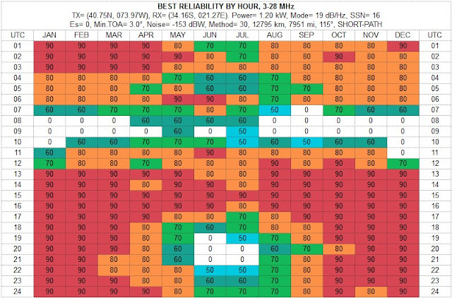
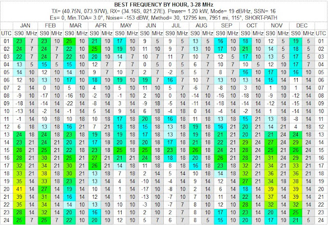
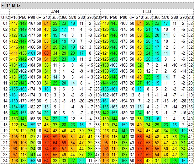
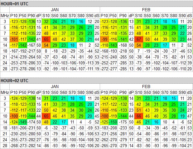
This service uses the user-entered or automatically determined Sunspot Number (SSN), and calculates the SNR (Signal-to-Noise) at 50%, 60%, 70%, 80% and 90% Reliability, SDBW (signal power at receiver) at the upper decile (10% = 3 days in a month), median (50% = 15 days), and at the lower decile (90% = 27 days) as well as the distribution spread between the lower and upper deciles for the SDBW (dP) and SNR (dS) for each month of the year for the given circuit. The results will be displayed as two overview tables and more detailed analysis tables by HOUR and by FREQUENCY.
This tool is an asset for more long-term propagation planning, or to choose the best month for a DXpedition.

The Best Reliability By Hour shows the maximum reliability among all the amateur radio bands from 3 to 28 MHz. For instance, for 01 UTC in January, we can see that there is at least one amateur radio band where the Mode or the Required SNR of 19 dB/Hz (= CW) can be reached 90% of the days in a month (or for 27 days). If the percentage is 80%, then the Required SNR can be reached 80% or 24 days in a month on some band. This table does not show what band would give the best probability; you will need to study the other tables on that result page. And consequently, 70% = 21 days; 60% = 18 days, and 50% = 15 days. When the percentage shows "0" on a white cell background, it means the probability of achieving the Required SNR for the Transmitting Mode is less than 50%.

The Best Frequency By Hour table shows you the best band among all the amateur radio bands, evaluated by the SNR (Signal-to-Noise ratio) at the Required Reliability of 90% (or the column "S90" in the table). The most potential cells have a specific color which indicated the performance of that hour in the given month. If the cell is white, the performance is not adequate enough. However, please note that coloring is independent of the Required SNR (or Mode) value, which means that the colors do not tell you how well that hour is with regard to the Required SNR we are investigating.
This table and the "BEST FREQ" analysis are somewhat competing with each other. However, in this table, the only criterium is the SNR at the Required Reliability of 90%, i.e. what is the SNR value which is predicted for 90% of days (or 27 days) in a month.
The detailed Season by Frequency and by Hour tables are available as HTML and as CSV data files for a more personal analysis. The following columns are calculated for all months:
- P10 = Signal Power (dBW) predicted at the upper decile (10%), or for 3 days in a month.
- P50 = Signal Power (dBW) predicted at the median (50%), or for 15 days in a month.
- P90 = Signal Power (dBW) predicted at the lower decile (90%), or for 27 days in a month.
- dP = the spread between the upper (P10) and lower decile (P90) in dB. If more than 47, beware!
- S10 = Signal-to-Noise predicted at the upper decile (10%), or for 3 days in a month.
- S50 = Signal-to-Noise predicted at the median (50%), or for 15 days in a month.
- S60 = Signal-to-Noise predicted at 60%, or for 18 days in a month.
- S70 = Signal-to-Noise predicted at 70%, or for 21 days in a month.
- S80 = Signal-to-Noise predicted at 80%, or for 24 days in a month.
- S90 = Signal-to-Noise predicted at the lower decile (90%), or for 27 days in a month.
- dS = the spread between the upper (S10) and lower decile (S90) in dB. If more than 47, beware!
 |
Season by Frequency
|
 |
Season by Hour
|
8. Planner
The Propagation Planner is a comprehensive planning tool for HF contesters and DXers. Until now, the problem has been that you really must be a dedicated enthusiast to make several runs of predictions to maximize your planning effort either in contests or DXpeditions.
Preparing and planning for any worldwide contest or DX expedition (or hunting a DX) require a thorough analysis of propagation predictions. The propagation predictions help you, so to speak, get a good grasp of the playing field, i.e. where to play and when. The predictions tell you when and on what bands the best openings are in the given direction at a suitable signal strength, so that the QSO rates can be maintained at their best; at what times it’s good to use those valuable long-path openings, and when to focus on working those hard-to-reach areas while the band opens elsewhere at the same time.
This online version now does all heavy-lifting and number-crunching on the VOACAP server, and visualizes the results in two ways: by CQ or ITU Zones (short-path or long-path) and by band-specific zone charts (short-path or long-path, as you wish). Be warned that there are quite a number of charts to analyze but I am confident all your efforts will greatly be paid off. The tables can easily be copied to word-processing software if you wish to make them fit better on paper. I strongly recommend using the Google Chrome browser to browse the pages as I found that some of the mainstream browsers on some platforms have hard time printing (and even copying) table cells with a background color.
It all boils down to making optimum use of the openings -- being in the right place at the right time. So, the better predictions you have, the better basis for operating planning. Nevertheless, we must remember that predictions are just that -- predictions, not exact science. And, due to the nature of VOACAP, you must visualize low-band openings with the help of grayline map software such as DX Atlas by Alex VE3NEA or GeoClock by Joe Ahlgren. VOACAP predictions are not so accurate there.
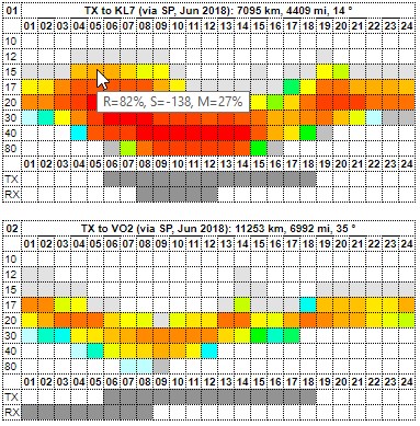
The results can be viewed zone by zone from the TX site the user provided. The colors indicate the probability of making a QSO between the TX and the Zone in question.
The elements of the top row are as follows (from left): CQ/ITU zone number, Path from TX to zone, Short-path (SP) or Long-path (LP), month and year, followed by the distance (kilometers & miles) of the circuit, and the bearing (in degrees) from TX to RX.
Below each chart, the sunrise and sunset times for TX and RX locations have been calculated and visually presented as horizontal bars. The silver color denotes night-time and white day-time. The exact sunrise (SR) and sunset (SS) times (in UTC) will come up as you hover the mouse over the TX and RX label texts on the left column. Here, in this example, the TX is "enjoying" the polar night so the sun will not rise at all. The date used in these calculations is always the 15th day of the given month.
All charts are interactive: if you hover your mouse over table cells, you will see a pop-up text, indicating the (VOACAP's REL) probability in percents, and the (VOACAP's S DBW) signal power values in dBW. For instance, the signal power value of -164 can be considered to be on the verge of the noise in remote locations whereas -103 corresponds to S9 on the S meter. Read more about translating the signal power values (S DBW) into S-meter values here:
http://www.voacap.com/s-meter.html .
 |
| Predictions from KH1 (Baker & Howland Isl) to different zones in June 2018. |
The left-hand side column shows the Zone number and the location within the zone. Many zones are geographically wide so, in many cases, a number of locations have been chosen from that zone to give a fair picture of the propagation possibilities.
All colors - except gray - indicate QSO-making probabilities. White means 0%, blueish 10%, greenish 30-40%, yellowish 50-60%, yellow-orangeish 70-80% and orange-reddish 90%, and pure red 100%. The color of gray does not indicate any probability value. Instead, it shows that, although VOACAP does not predict any probability for that specific hour, some signal power has been predicted which may translate into workable conditions. So, in a sense, gray indicates "a gray area" where QSOs may be possible. Typically, these gray areas can mostly be found in low-band predictions charts.
In addition to the cell colors that indicate the predicted RELIABILITY values, there are also three cell characters that indicate the predicted Signal Power (SDBW) and MUFday probability. This information, combined with the Reliability predictions, will help you select the most suitable time and frequency for the contact.
The cell colors reflect the predicted Reliability: red is best, white is worst
The following characters reflect the level of Signal Power: ++, + and ●
++ = Signal Power is S9 or more, and MUFday is 70% or more
+  = Signal Power is S6 or more, and MUFday is 50% or more
●  = Signal Power is S1 or more, and MUFday is 30% or more

colored but no char = Signal is S1 or more, but MUFday is less than 30%
white = Signal Power is below or at the noise
9. Planner DIY
This version of the Propagation Planner offers a quick overview of propagation to five freely-adjustable locations. This service uses the same red markers as the QSO Window service.
The output is as follows (click to enlarge):
10. P2P Grayline, or sunrise/sunset times for the current and next month
The Grayline calculates a wealth of solar-related information for the Transmitter and Receiver, and for the geographical midpoint of the circuit, covering the two months: the current and the following.
There are seven different times which will be calculated for each site (TX or RX): three related to sunrise, three related to sunset, and one related to solar midnight. The eight time parameter (MIDPT MNITE) is the solar midnight at the geographical midpoint of the circuit in question.
Sunrise-related times
• DAWN = a point in time when the sun is 6 degrees below the horizon before sunrise
• RISE = the sunrise time at the horizon
• POST = a point in time when the sun is 3 degrees above the horizon after sunrise
Sunset-related times
• PRE = a point in time when the sun is 3 degrees above the horizon before sunset
• SET = the sunset time at the horizon
• DUSK = a point in time when the sun is 6 degrees below the horizon after sunset
Solar midnight
MNITE (and MIDPT MNITE) = This is the time opposite to solar noon when the sun is closest to the nadir (the direction pointing directly below a particular location), and the night is equidistant from dusk and dawn. The solar midnight rarely coincides with midnight on a clock. Solar midnight is dependent on longitude and time of the year rather than on a time zone. [Wikipedia: https://en.wikipedia.org/wiki/Midnight]
POST and PRE times
The POST and PRE times are based on an educated choice; there is no pre-meditated scientific theory behind "the 3 degrees above the horizon". We know from experience that the low-band propagation starts to deteriorate at some point after sunrise, and that the propagation starts to get enhanced before the actual sunset, and "3 degrees" was my personal choice for this purpose.
There can be cases where no time is calculated but "--:--" is shown instead. This means that the sun does not reach the degree position set for the calculation.
Predicting probable grayline propagation enhancements
Not going to any deeper theoretical discussions here, there are basically three periods of time when distinct propagation enhancements have been reported on low bands.
These are as follows:
1. Both the Transmitter (TX) and Receiver (RX) are situated in the terminator zone. In my calculations, the terminator zone has been defined as the zone limited by DAWN and POST (post-sunrise) in the morning as well as PRE (pre-sunset) and DUSK in the evening. If there is an overlap between the Transmitter's and Receiver's morning/evening terminator zones, the times will be colored as follows:
a) TX DAWN-POST and RX DAWN-POST zones overlapping:
TX DAWN-RISE-POST: red
RX DAWN-RISE-POST: red
b) TX DAWN-POST and RX PRE-DUSK zones overlapping:
TX DAWN-RISE-POST: red
RX PRE-SET-DUSK: blue
c) TX PRE-DUSK and RX DAWN-POST zones overlapping:
TX PRE-SET-DUSK: blue
RX DAWN-RISE-POST: red
d) TX PRE-DUSK and RX PRE-DUSK zones overlapping:
TX PRE-SET-DUSK: blue
RX PRE-SET-DUSK: blue
2. The Transmitter (or Receiver) is in the terminator zone and the Receiver (or Transmitter) is in darkness. Whenever this condition is met, the times in the DAWN-RISE-POST and PRE-SET-DUSK columns will be colored in green. This is one of the most common cases for signal enhancement on the low bands.
3. The Transmitter (or Receiver) is in the terminator zone and the Receiver (or Transmitter) is in darkness AND the midpoint of the path is in the solar midnight. This is a special case of Number 2 in this list but a very important one. Currently, the solar midnight period at the midpoint (labeled as MIDPT MNITE in the tables) is defined as a time period of plus minus 7 minutes from the time calculated and shown in table. The MIDPT MNITE time is the exact calculated solar midnight time but, in my calculations, I consider that the midpoint midnight period is plus minus 15 minutes from that time.
There can be three colors for the time: black (default), red and blue. When the color is black, the midpoint midnight time does not overlap with the DAWN-RISE-POST or PRE-SET-DUSK times of neither the Transmitter not the Receiver.
The colors of red and blue will be assigned as follows:
a) Midpoint midnight period and TX Terminator zone (morning or evening) overlapping: RED
b) Midpoint midnight period and RX Terminator zone (morning or evening) overlapping: BLUE
As a special mention, if the solar midnight period, a period of plus minus 7 minutes from the MNITE time at TX/RX, overlaps with the Midpoint Midnight period, the times in the MNITE column will be colored as follows:
a) TX midnight period (MNITE) and Midpoint Midnight period overlapping: RED
b) RX midnight period (MNITE) and Midpoint Midnight period overlapping: BLUE
11. Distance
This graph shows how the propagation parameters of REL, MUFday, SNR, and SDBW (Signal Power) develop along the Great-Circle Path from TX to RX.
Choose the band of your interest from the Frequency pop-up menu, and use the time slider to change the UTC time.
A more detailed explanation of the graph:
12. MUF, REL & SDBW Maps
This service is able to plot coverage area maps featuring MUF (Maximum Usable Frequency), REL (Circuit Reliability) or SDBW (Signal Power) values. What is more, it can also calculate and display multiple coverage maps at one go. The input values for the coverage maps has a separate section under the “Settings” button.
So when viewing the result page with the maps, you can then conveniently print that page to PDF. You may need to install some extra tools such as CutePDF Writer if this functionality is not offered to you by your operating system as standard.
Please be also advised that all the coverage maps created in the service will be deleted from the server in a more frequent cycle so please do not link directly to the maps produced.
13. DXCC Grayline, or sunrise/sunset/midnight times for all DXCC entities
The DXCC Grayline calculates the sunrise, sunset and midnight times for all the defined DXCC entities on the current day. There are also other tools in this service, see more at
http://voacap.blogspot.fi/2016/11/voacap-greyline-user-manual.html


